The folks over at TheDieline.com regularly reenvision products. Dramatically. I only just stumbled across their fabulous sit and was in love at first site:
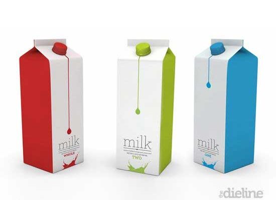
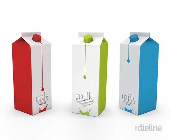
Heck, they are so outside the box the occassionally redesign “the box” as exemplified by the above milk box expirement. Just love the solid coloring and evocative white on the face. The type is a beauty to behold and the splash at the front bottom just adds that extra something. Very nicely done.
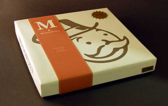
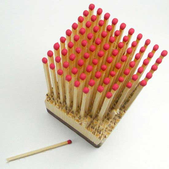
And this monopoly experient submitted by a student – gorgeous. I want one just so I can put it on my bookshelf. Amazing. The color palette is extraordinarily bold in its restraint. I am particularly enamoured with the logo on the front cover and the overly stylized curves. Or how about this redesigned matchbox?
Nothing better than a nice design website. .. at least in my opinion anyway. You can check them out here: www.thedieline.com


