I’ve done my fair share of logo designs. And I have never enjoyed them. Website design I dig. Logos? Blech. And I think that is mainly because they are so stinking subjective. Who knows what a good logo even is? A good web design? Easy. I mean, its right there. Beautiful responsiveness waiting for the good denizens of the interwebs to interact with. Simple. But a logo? A letter C? A triangle? That is blue? What?
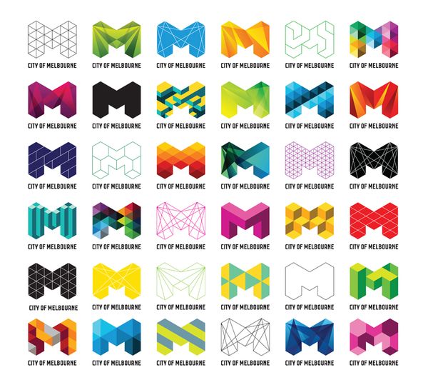
Like, take for example this redux of the City of Melbourne identity by Landor Sydney…
Some permutations are acid trips. Some are boring. Some are just bleh. But none of them shout at me… I’m the ONE, PICK ME. I mean… I obviously have opinions. But at the end of the day its a letter M for heaven’s sake. If you were to give one of them some context though. Like, I don’t know. A palette color, or a background color, something! And then a font to mix it up a bit? Now I’m with you. Now I’m seeing something else here.
Ok, now, I’m feeling something. At least a little something. But devoid of more of a full treatment my eyes start to go cross-eyed and my head kind of explodes. So that’s my problem. I just don’t see it. But here we have Aaron Draplin (who, can I randomly comment, looks more like a lumberjack than a designer?) talking us through a design logo effort from beginning to end. It is fascinating to watch. I work similarly to Aaron in a lot of ways. but he sees a lot of potential where I see dead ends.

