I’ve been saying for years, and years, that the scariest, and one of the best books of all time is definitely The Shining. And the movie, with Jack Nicholson is a serious cult classic. Just a phenomenal movie. Definitely two amazing heavyweights in the world of books and movies. Redrum, Redrum. I still remember where I was when I read that book for the first time. The ghost twins in the hallway. The axe. The hedgerow maze.

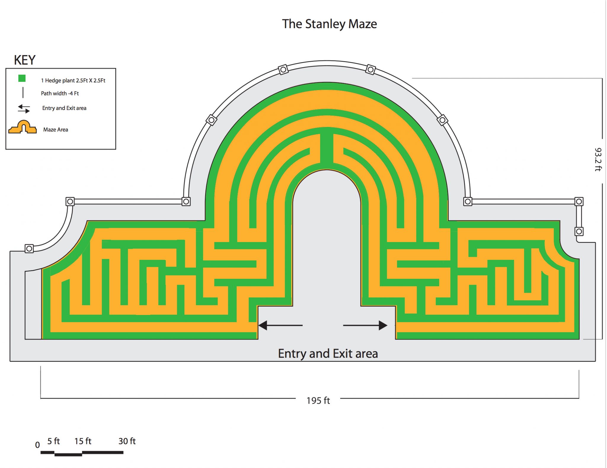
When I did mine, I tried to make it as difficult as possible in the space allowed. Which there wasn’t a whole lot available. But the reason for making it more difficult than symbolic was simply because that is how the books worked, as was the movie’s. The maze became a monster to itself… the house was a monster unto itself. A character actually. And so to be realistic, or representative anyway, it needed to be as complicated as physically possible. So after much dithering and pontification… here is the design I chose to submit to The Stanley.
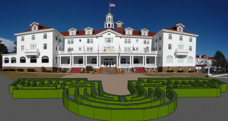
You can see by the space allowed, there isn’t a ton of room to work with. But even so I tried my best to give the best ride possible. It will be interesting to see what the winning design looks like, and whether they went towards a more decorative style, or complicated. The CAD render is one I made of my maze. I was curious if I could create a video running through the maze. Totally did it, but it was a little choppy. Still working on cleaning it up, and maybe I’ll post it after. Google Sketchup is pretty sweet. Either way it was a fun competition to partake in. If you are interested in the rules and the competition detils you can find them all here. Oh wow. I barely made it in time apparently. Didn’t realize the deadline was so soon! Sorry everyone.


