Nick Smith Pantone Classics

Nick Smith Pantone Classics
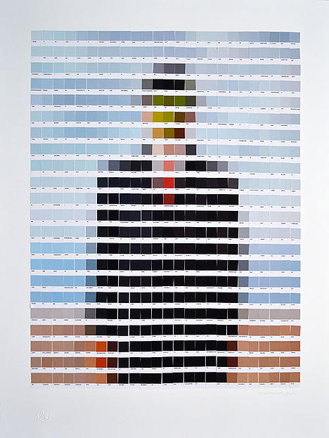
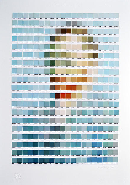
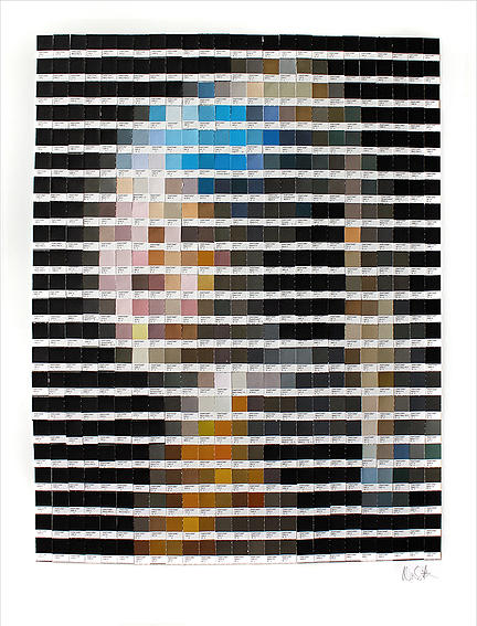
Just discovered Nick Smith’s pantone series are fascinating. Nick has taken classic pieces of art and overlayed pantone chips for their colors.  Not a huge fan of Nick’s work, but its interesting.  So interesting I decided to play with my own in Photoshop further down the page.
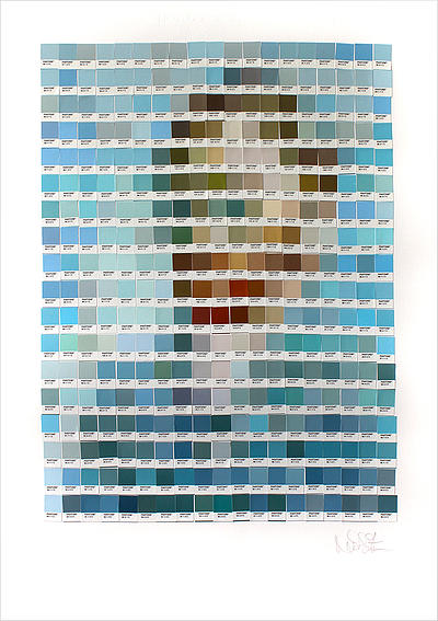
pantone1

pantone2

pantone4

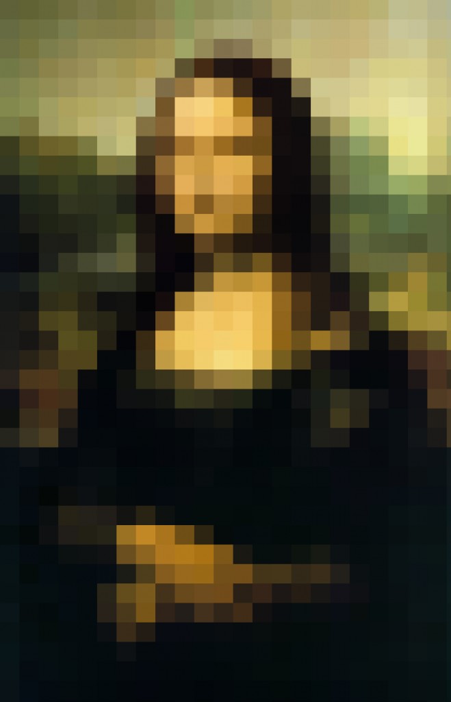
pantone5I found these so fascinating I went looking for a way to develop a similar look inside photoshop with actions and rules automatically (minus the custom pantone colors).  And as I was playing around with the concepts I made a square pixelated version of the Mona Lisa.

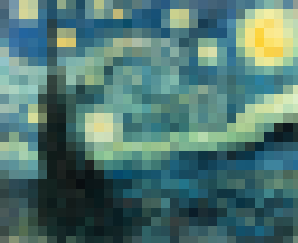
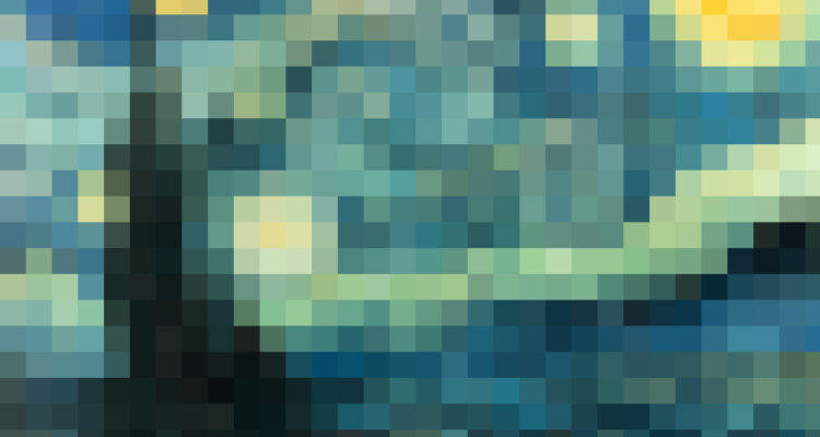
pantone-monalisaI actually like how that version of the Mona Lisa came out.  Encouraged by the results I then went off and created a squarified version of the Starry Night.

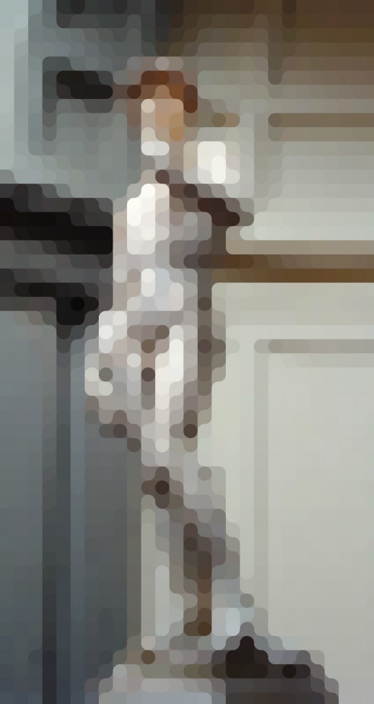
pantone-starryThen I started playing with other shapes and variations.  Here is a circular version of Michelangelo’s David:

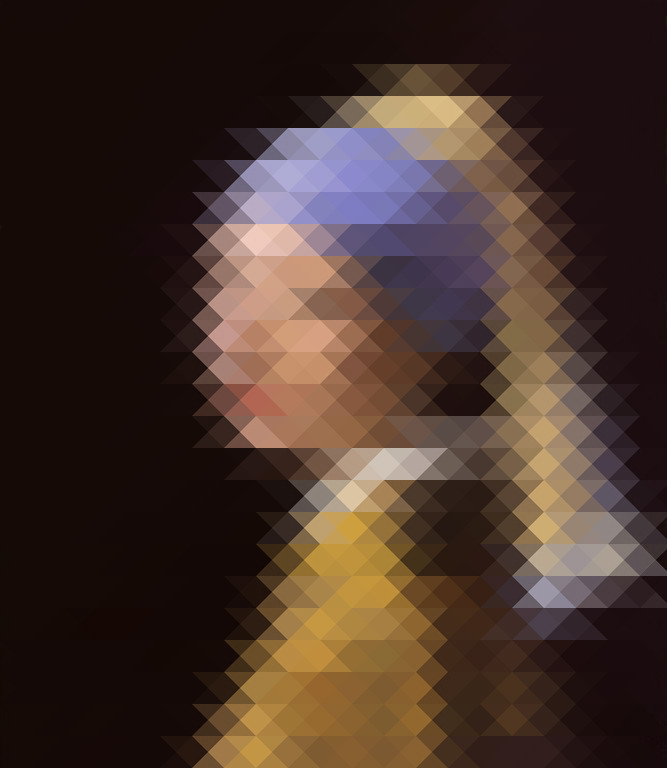
pantone-DavidAnd here is a triangular version of A Girl With A Pearl Earring.

pantone-earringI don’t know, I really dig the patterns and the constructs created by these versions of the originals.  Definitely not art per se, but interesting all the same.  If you are interested in learning more about Nick and his pantones, you can check out his online gallery here.