

Gentlemen of Letters Documentary
Letter forms. Signage. Graphic Designer. Structures. Formation. Hand painted. Human quality. Subconsciously drawn. Letter types. Manually made. Bartered Price. Cold & rain. Draftsman.
This gorgeous short 16 minute documentary is heaven. Sign painters are just a brilliant homage to a long forgone era. A hand painted sign, hand lettered signage, is just a lovely piece of quality and a snapshot in time.
Kind of reminds me of this map of Chicago made completely out of typography.
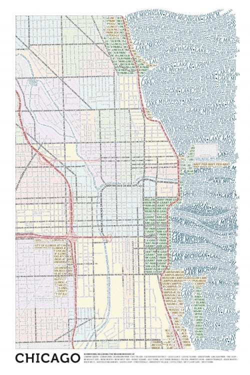
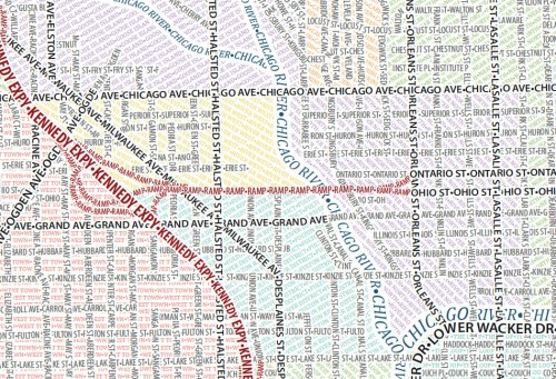
These are truly great maps of Chicago from Axis maps made entirely from type. This took more than a couple hours in Illustrator. They’ve also don’e one of Boston as well. Great typography is a thing to behold. I’ve always been very very poor at my type treatments work. Logo design, Identity development… etc. It just takes a certain kind of person to juxtapose a perfect New Roman with a gorgeously playful rococo typeset.
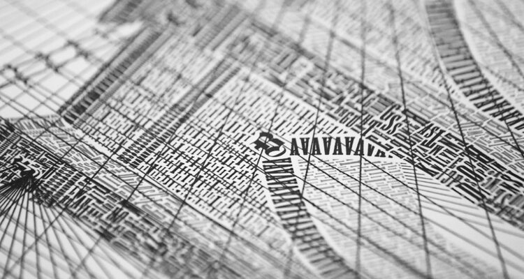
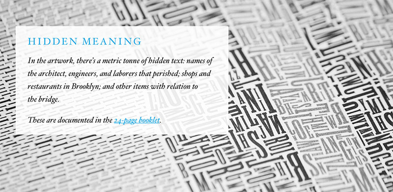
Which in turn reminds me of the great designer Cameron Moll that has done several drawings solely utilizing type. My favorite is his Brooklyn Bridge project.
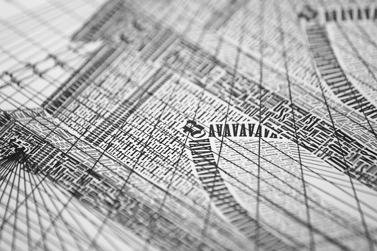
Hand painted signs detailed out in the Gentlemen of Letters Documentary is just the purest form of this amazing world of type that still lives and breathes today. But the next time you walk by a vintage sign downtown, or by a gorgeous work of design – don’t just see the sell, or the call to action… but see the work itself and consider the artist working behind the colors, the billboard and the letters.