Ever Wondered How Apps Are Designed and Developed?
First, let me set the record straight. I’m not going to try and teach you how to design an app with this post. This is just going to be a high level walk through of the processes involved with creating an app, kinda like the show, “How Stuff Is Made” on the Science channel. Immediately after watching how a wind turbine is made you are no closer to making a wind turbine yourself, but it is an interesting ride along the way all the same.
Come on. That’s goodness right there… Right? I had no idea how those suckers were built. Anyway, that is exactly what I’m going to do for you here. Sort of. I plan to walk you through the process of building an app from idea through to development so you can see how it generally works.
The Need
All development begins with a need of some kind or other. If it isn’t needed, then you probably shouldn’t be building it. I know right? Clever. With the app I’ll be walking your through this was an idea I had to help solve a business problem. The app I’m detailing here still needs to remain fairly on the down low because there are only a handful of people that know about it even inside the business. And because my idea was attempting to optimize processes and not build Angry Birds 93 this will look a lot different. But the process is still ultimately the same.
My idea was fairly simple and yet if successful could increase the bottom line upwards of a percentage point or two. Which would be crazy if successful. 1 percent? On an almost billion dollar organization? Yes thank you. So the need is to streamline a current process, to make it faster, and more responsive to our customers. Yes? Great.
The Idea
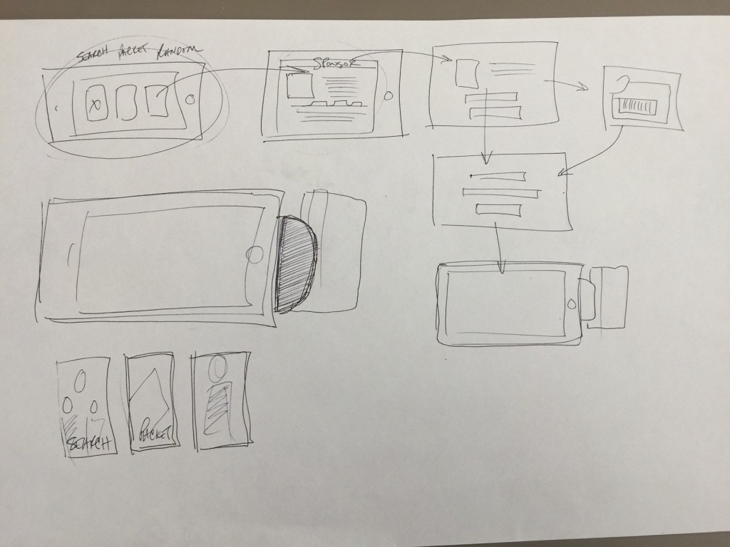
After you have a need, you need to come up with ways to solve the problem with technical solutions. At this point I was pretty clear that the form factor I wanted was an iPad app because of the venue this app would be operating in. I knew it needed to be big enough to hold, and yet easy to operate and interact with. So I sat down with a big sheet of 11×17 paper and just started thinking through the potential flow of the interactions within the app. Right? Here’s the home screen. They click option one, it takes them to a secondary screen with these options on it. And then here we have the payment and checkout flow. Here was the very first sketch I created thinking through my options.
Again, I get it, this diagram is hard to understand if I don’t walk you through each screen and explain it to you. But what I was working on here was a high level iteration of the flows and the process. And as I sketched I was thinking through the feasibility of each screen. Was it comprehensible by the audience. Did the flow move quickly and succinctly? What about high level UX (User Experience)? Too many? Too few? Button placement? Seeing this first flow made a ton of sense to me.
I drew probably 20 of these flows before I was confident that the options and the flows made sense. Once I was comfortable with the flow I jumped to the next step.
Detailed Wireframes
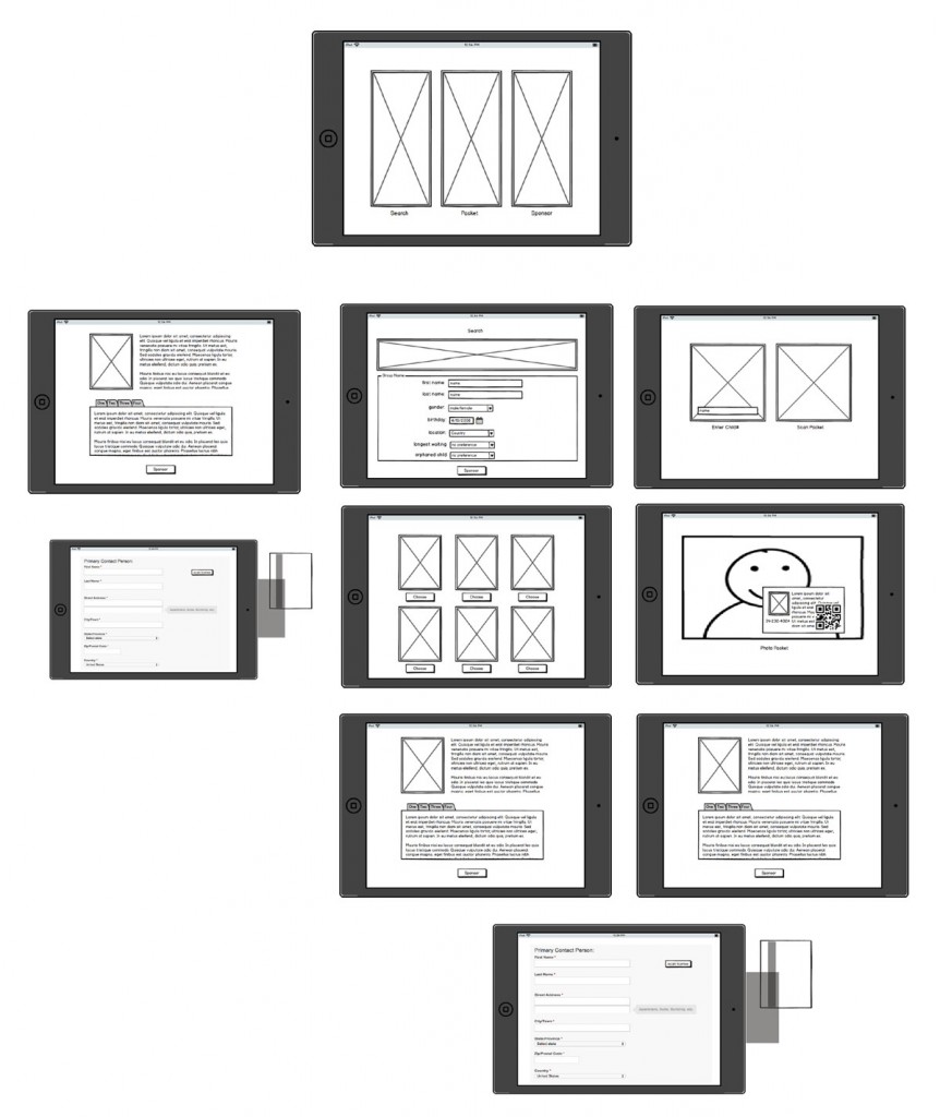
The next step probably sounds scary to the uninitiated. Detailed wireframes. Wireframes take your previous step to the next step – which is a formalized view of what it is that you want to build. Here are just a few of the formal wireframes I pulled together for this app.
No design at all. Adding design is actually a rookie mistake. It would make sense that you should. Gives it a more compelling story. Helps sell the idea of the solution involved. Gets you more buy in from the customer maybe? But what happens when you start painting your wireframes is that the customer fixates on design to the expense of all else.
I don’t think you can see it in these wireframes, but even the content is abstracted. Lorem Ipsum is added in lieu of using real text in order to just indicate where text will be going. It’s latin, and it is a rough indicator of what English will look like in that spot, that isn’t English. I remember one time I created a design and my boss at the time inserted text he pulled from a research paper on the topic the website was addressing. The only problem? The research paper in question was directly counter to what the customer believed – and instead of discussing the wireframe (as we had hoped) we ended up spending the whole meeting talking the customer off the ledge because of this one bit of text on the page. The other problem though can be that customers NEVER get Lorem Ipsum. What is that on the page? Why can’t I understand it. What language is that? What’s wrong with your diagram? These are all real questions I get very very regularly. But besides all those questions, it is the best method for estimating a general feel for where text will go, where images will go, where buttons will go, and how they will basically work. Right? That is what your detailed wireframes will do for you.
We normally use a tool called Balsamiq which allows you to draft clickable wireframes that are a lot like little choose your own adventure stories. Sure, they are just diagrams… but they also show the flows of each click path. The customer should be able to manhandle these wireframes and work with them and see how the finished flow will look. Right? There are hundreds of different tools out there, and there are still people out there that insist on using Microsoft Word and Powerpoint for their wireframe discussions. (Please, do not leave messages below about how that is your tool of choice. I do NOT want to hear about it. Just leave me ignorant to this fact, ok? Great, thank you.)
Rough Design Comps
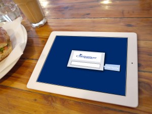
After you have sign off on your flows and your detailed wireframes, now you need to start playing with ideas in full color. Plan to fail really really fast in this space. Here are a few of my first swags at what the app could look like that never saw the light of day. I had mentally constrained myself to match some internal design work that I shouldn’t have. But you get the idea of what you are trying to start to do here. It’s a completely different user experience than the wireframes.
You need to start visualizing the different elements and components that make up the app. The color schemes, the buttons, the fonts, the calls to action really needs to start firming up here. And this is the most arbitrary of all the areas. That is why designers are worth their weight in gold. Obviously I had to work within the constraints of the company’s style guide, but generally speaking the sky is the limit.
Now is when you’ll want to start thinking through performance testing and load considerations. Now is when you start thinking about whether you expect the app to be on a wi-fi network, cell, or whether it needs any connectivity at all. For our app we had to do a ton of cacheing and data storage on the device ahead of time so that it would work quickly and without any connectivity at all potentially.
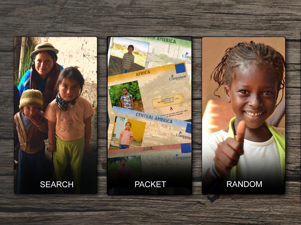
After that previous design blew up completely, I went back to the drawing board (or the photoshop blank canvass?) and started over. Here is what I came up with for a new skin for the app… while keeping user experience and form factor first in my mind.
Now For the Hard Part
Alright, so… you had an idea. You sketched your idea up. You dialed in your flows. You pulled together ideas about data, buttons, layout. You designed a few iterations of the look and feel. You gussied it up a bit. And now… and now what? Not anyone can do what you just did… but the number that can do what you just did is SIGNIFICANTLY higher than the number of people that can do the next step… and that is, code it. That is where you go from Community College to Doctoral program. From the minors to the bigs.
First, take a deep breath. You can do this. But for the love of all that’s good and holy don’t freak out on me here. We have lots and lots of options that vary on the price continuum incredibly. Let me bracket this thing in for you. Offshoring will cost you X. Nearshoring will cost you X+1. hehe. Onshoring will cost you 4X. And a boutique development firm will cost you 100X. Each one of these options brings pros and cons.
I have an app idea that has been flipping around in my head for a few years now that I have had a couple developers work with me on. It’s an app for my Bible Questions data. The what is irrelevant. But I priced out that app on E-lance (a now defunct offshoring solution) and also locally. The development cost was measured in the HUNDREDS of dollars for offshore development. To the multiple multiple thousands of dollars on shore.
Hold it, hold it, hold it. If you don’t have the most awesome, most amazing, Project Management skills the world has ever seen… (and let’s be brutally honest here, you probably don’t) You will fail. FAIL FAIL FAIL. And by fail I mean, just take the thousand dollars that the Chinese developer quoted you, and instead of giving it to him, walk into your kitchen, put it in the blender. Then, set it to vaporize and watch. Because your money would have been better spent doing a “Will It Blend Special” than it would be giving it to the Chinese developer. Promise.
Offshoring
But if you really think this is the path for you. It can be done. But you have to do more than what I’ve already shown you. Instead of just doing detailed wireframes, you will REALLY need to do detailed wireframes. Every single possible iteration. Every single possible jot and permutation needs to have been thoroughly documented.
- Business Requirements
- Detailed Wireframes
- Complete Technical Specifications
- Use cases & User Scenarios
- Thorough testing criteria
- Acceptance Criteria
Which is why a local developer becomes really savory sounding. You are talking about hundreds of hours of technical details being documented even before you put it out for a bid. If you don’t have all that done the guy will move on to the next job in a heartbeat. He isn’t going to wait for you. Promise. Because he’d rather go with another idiot that doesn’t have his crap documented so that he can deliver EXACTLY what the email said for him to deliver, which is nothing like what the guy had in mind. Nothing.
I personally have off-shored very successfully in both the web and the mobile space. It really is doable. But please please please, use an escrow service. And at least have a clear acceptance criteria defined. Otherwise you will find yourself with the mafia calling you at 3 am wondering where the developer’s money is. No, I’m not kidding. This has happened to me. Literally. They highjacked my domain and my hosting, and said if I ever wanted to see them again then I better pay and … by the way, there was a “service fee” too. (This happened because of a discrepancy over only $200. I kid you not. $200.)
On Shore
The really nice thing about working with a local developer is that you can look into their eyes and validate they understand you. The app should swipe this way. And flip that way. Bounce over there. And light up here. They’ll give you tactile feedback that will let you know that they get it. Offshoring never allows for that kind of confidence. But even when you get that feedback it still will sometimes go all pear shaped on you. So it isn’t a guarantee of anything really.
The more you can bring the above documents the better it will go and the clearer it will be for your developer (or developers). And I would also recommend daily or weekly meetings and demos. In the software development world this is expected and even understood as normal. The key phrase you have to remember is, AGILE. We are running this as an agile project. Which is a technical buzzword, but immediately brings all manner of goodness for you. The first is, demos. Normally Agile projects run with daily standups about issues that anyone is having. They also usually have bi-weekly demos (depending on the length of the sprint… yeah, Never mind. Just trust me that regular demos are normal) that will show you the progress made over the last week or two. You also need to have the developer regularly check in his code into a source repository that you have access to in case he goes AWOL all of a sudden. Also, make sure that your contract clearly states that you own the code… that it is yours. Sometimes developers try and slip a fast one by you that allows you to “License” the code from them, and then the next thing you know there are 42 others with your solution.
Beta Launch
I worked as the CTO for a startup for about a year (that ended up imploding, as do 99.9% of them) and we had made it far enough with our funding (Jeb Bush considered bringing us to Florida along with a handful of other startups to help kickstart a silicon valley equivalent there… but that all fell through and with it the company) to begin a closed beta, which I highly recommend that you do too. There are a ton of solutions out there that will allow you and your team to side-load your app without going through the app store. Test flight is my own preferred solution – but there are a lot of them. It will also allow you to distribute to a pool of testers (or mechanical turks) so that you can try various devices and more edge case scenarios tested. And once you hear back from your testers and your beta users, knuckle down and get your bugs fixed.
Launch
And once you are fairly confident that you have mitigated most of the issues your users and your testers say that you have… launch. And then sleep.
In the last few months I think my mobile developer and I have created 4 or 5 apps. The one I showed you here was basically completed (start to finish) in less than a month. And this is an app that is PCI (Payment Card Industry) compliant. Triple Dez secured. PII secured. Yadda yadda yadda. So all that to say that it really is possible to develop in this space quickly and iterate and pivot when the apps miss the mark. But yeah, I have a dedicated app developer that I trust. It is possible to find an app developer that you can learn to trust like I have. And when you do, don’t let them go.
So from a “How Its Built” standpoint – does that make sense? Again, this wasn’t meant to be a primer per se. But it might open your eyes so that you can see what is possible.


