
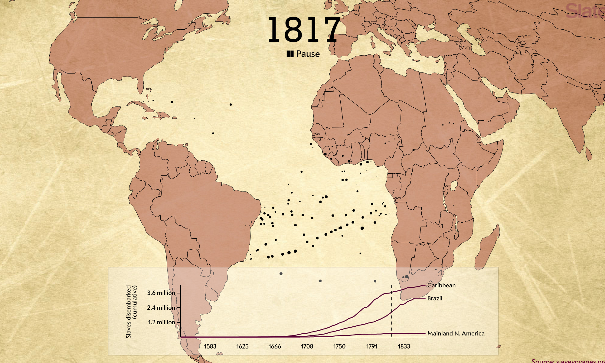
Entirety of Atlantic Slave Trade In 2 Minutes
Its rare that information completely transforms the way you think about something. I mean, it does… but never really completely. Well. I mean sometimes it does. But, oh never mind.
Let me come in again.
I had a few preconceived notions about the slave trade. I assumed that the bulk of the individuals shipped went to America. It’s just such a pervasive conversation here in America. Its front and center in the news, our politics, everything. Its everywhere. From college entrance discussions, to police biases and bigotry… its one of the most talked about discussions we have here.
So when I saw this new infographic? Movie? Infographic movie? Whatever. When I saw this data visualization (there we go!) it blew my mind. Slate pulled this together by getting the data from the Trans-Atlantic Slavery Database and then coupling it with google maps which gave us one of the most amazing data visualizations I’ve ever seen.
Go watch the visualization here
Sorry I couldn’t import it – but its good to read the article as well that accompanies the visualization. So what was my epiphany? This quote for the article is what rearranged my brain matter.
“Of the more than 10 million enslaved Africans to eventually reach the Western Hemisphere, just 388,747—less than 4 percent of the total—came to North America.”
Don’t get me wrong -388,747 is still way way too out of control to fathom. And minus the 10 million number staring at 388,747 is just crazy. But to learn that it comprises only 4% of the total Atlantic Slave trade is just mind altering. So that was just the first thing I learned by watching this data visualization.
The other thing that just wrecked my brain was the affect of watching these dots flying from Africa one after the other. Its like watching a swarm of evil wasps. Its just horrible to imagine. Boat after boat after boat flooding South America and the Bahamas, and various other ports of call in the U.S. is just terrible to comprehend. I see a single dot flitting by from one continent to the other and I think 200 slaves, in irons, in the bottom of a boat. Awful. And regularly slavers chained them over top of one another? For weeks?
Yeah, so that little data visualization has ruined me. The effect of slavery on the United States has been devastating. The effect of the other 96% on the rest of the world? Wow. So yeah, take a moment out, and go read this post and watch this visualization. Because it’s heartbreaking… and it’s good to be changed every now and again.